Join our Facebook Group
Hick’s Law
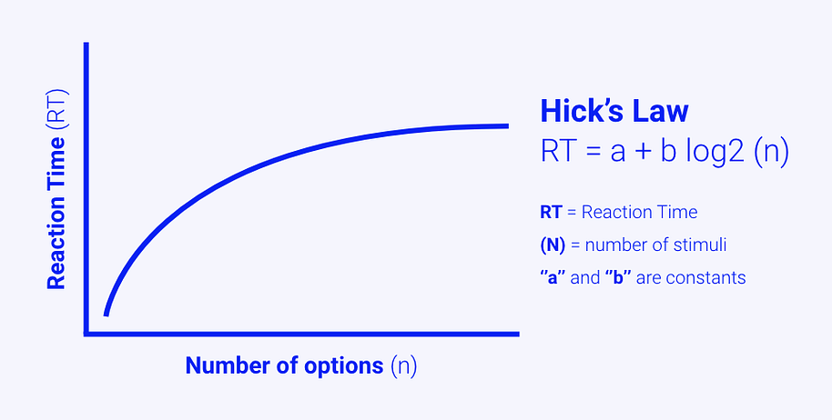
Hick’s Law (or the Hick-Hyman Law) states that the more options there are, the longer and more effort it takes to make a decision. The more options there are, the more time and frustrations it takes to make a decision.
Everyone wants to get the job done faster. The more requirements or options are available per task the more time and effort is needed to complete it.
What is Hick's Law?
In (school) books you often have this index at the end of the book, one gigantic list which is your search function from the computer.
This works because the list is ordered alphabetically and words are used that we can understand. Imagine if this list is not ordered and the authors used words and terms we don't understand, this index wouldn't benefit us at all.
One of my friends explained it like this: If you come across a beetle but you do not know its name, you want to go to that chapter where all beetles are explained. That's where you use the Table of contents for in a book, but if you want to know a ladybug's average life expectancy, you go to the index search for the letter L, Ladybug and average life expectancy.
The example is so great because it explains Hick's Law well. No matter where your eyes land on the index of a book you know what you're looking at and what you have to do next. You know what to do next because it's ordered alphabetically and you can quickly skip all the letters you don't need. This makes scanning a long index or any other list quite efficient.
Hick-Hymen Law proven in marketing

This law says the more items in a list, the longer it takes to make a selection. That's not very surprising. But there are exceptions, lists that have 1. Items in order and 2. Items that are known to the user. Combining these two attributes to make for efficient scanning. Even if there is a long list, users can still be very efficient with it.
If you're ever designing a long list of menu items, consider using Hick's law in web design.
Hick's Law in Web Design Navigation
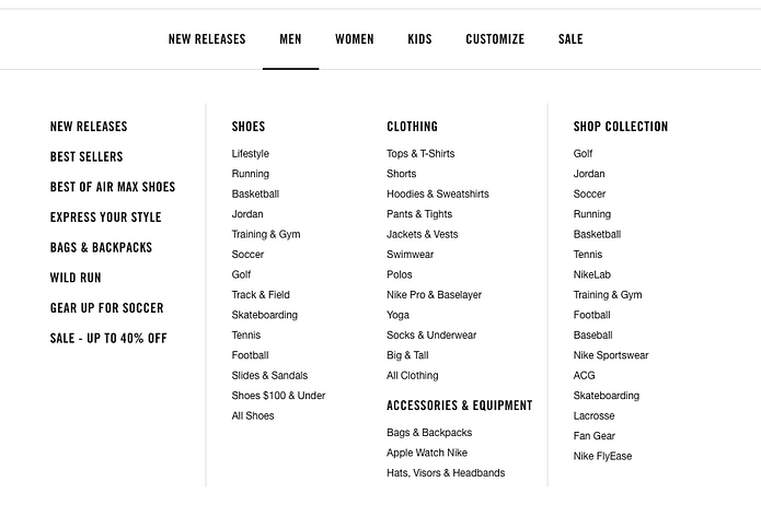
Another example can be found in the "mega menus" on desktop websites. Clothing e-commerce websites often have categories like Men, Women, Boys, Girls, etc. When you hover over them there's a dropdown element containing specific categories like "Men > Shoes > Type of shoe".

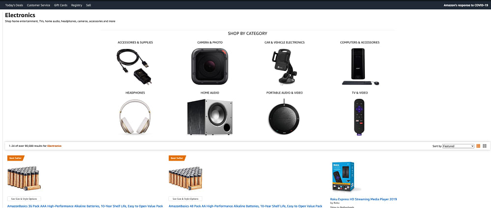
Amazon also applied this principle in their navigation when you click on any category on the homepage. To help you get to your desired products more quickly they've created subcategories. For "Electronics" this could be "Accessories & Supplies", "Camera & Photo", "Headphones", etc. Since there are fewer choices, it takes less time and fewer frustrations from the users.

How to improve your website using Hick's law in combination with forms?
Imagine you're registering an account on a SaaS (Software as a Service) website. This SaaS has a personal license you want to subscribe to because it's free to use. When you get to the registration page, you see all these mandatory fields you need to fill out in order to complete the process. These fields include first- and last name, job title, name of the company you're working for, size of the company, industry you're working in, e-mail, phone, password, etc. In other words, the barrier to entry is too great.
The only thing you want is the free version of the tool. You're wondering why this SaaS platform wants all this extra information besides name and email. From the users' perspective, it takes extra time to fill in all the fields and it's frustrating to go through. Unnecessary Effort = Frustation Poor Conversion
Hick's law can be applied to web design in this case. Only make fields mandatory that are really necessary. In this case, e-mail and password are enough. Often a name is mandatory so they can do a little personalization which is nice, but the rest is unnecessary at this point in time. According to Hick's law, conversions will decrease since it takes more time to fill in all the fields and it's frustrating.
Conclusion
Making choices is often not easy. Especially when to many options are presented at the same time. It is often difficult to make a decision and it often takes a little longer than we would like to. The article clarified why and how this is happing. Make sure to consider Hick's law when designing all sorts of long navigation and forms.
Example of hypothesis applied
If we reduce the number of options, then the click-through rate for all users on mobile and desktop devices will increase, because of Hick's law.
References
The references contain experiments and studies that prove this bias is there.
Books
Would you like to go more in-depth? Here are our recommendations:


Frequently Asked Questions
What is Hicks Law?
Hick’s Law (or the Hick-Hyman Law) states that the more options there are, the longer and more effort it takes to make a decision.
What is Hicks Law web design?
Hick's Law in web design can often be found in large menus of websites. There are so many options that it's hard to make a decision.
Who are the authors of Hick's Law?
Hick's law also known as Hick–Hyman law was named after British and American psychologists William Edmund Hick and Ray Hyman.
Will you use psychology for your experimentation process?
Are you curious about how to apply this bias in experimentation? We've got that information available for you!
Join over 452+ users
- Lifetime access to all biases
- Filter on metrics, page type, implementation effort
- More examples and code for experimentation
Choose your subscription!
Pay with Stripe
Lifetime deal PREMIUM
Get access to the search engine, filter page, and future features.